GRAPHICS_EXAMPLES_GRACE, examples which illustrate how various kinds of data can be displayed and analyzed graphically, using the interactive executable program grace().
Note that GRACE is limited to "2D" graphics. That is, it can easily plot a function y=f(x), or a parameterized curve x=f(t), y=g(t), as well as scatter plots, histograms, and so on.
But GRACE cannot do graphics involving 3D data. It cannot compute and display the contour lines of a function z=f(x,y), or show a surface z=f(x,y). It cannot accept information about a 3D object, such as a sphere, to display a 2D projection.
The computer code and data files described and made available on this web page are distributed under the GNU LGPL license.
GRAPHICS_EXAMPLES programs are available in a C version and a C++ version and a dataset version and a FORTRAN77 version and a FORTRAN90 version and a MATHEMATICA version and a MATLAB version.
GNUPLOT, examples which illustrate the use of the GNUPLOT graphics program.
GRAPHICS_EXAMPLES_CONVERT, examples which illustrate how various kinds of data can be processed and modified using the ImageMagick program convert() and its related tools.
GRAPHICS_EXAMPLES_DISLIN, examples which illustrate how various kinds of data can be displayed and analyzed graphically using the graphics library dislin();
GRAPHICS_EXAMPLES_GNUPLOT, examples which illustrate how various kinds of data can be displayed and analyzed graphically using the interactive executable graphics program gnuplot().
GRAPHICS_EXAMPLES_OCTAVE, examples which illustrate how various kinds of data can be displayed and analyzed graphically, using the interactive executable graphics program octave().
GRAPHICS_EXAMPLES_PLOTLY1, examples which illustrate how various kinds of data can be displayed and analyzed graphically, using the plotly() program (version 1) from a browser.
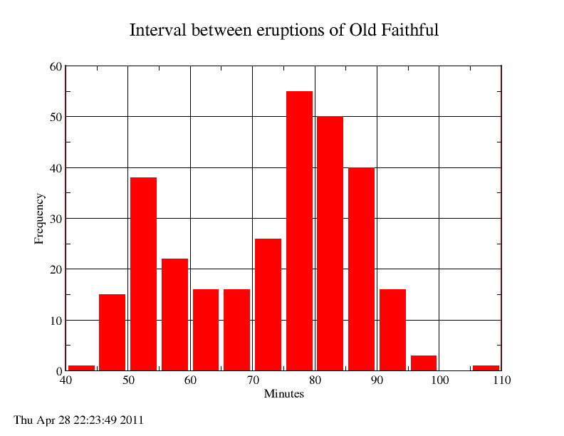
GEYSER contains the waiting time in minutes between successive eruptions of the Old Faithful geyser. 299 values are recorded. The data ranges from 43 to 108. It should be displayed in 14 bins of width 5 from 40 to 110. The data comes from Martinez and Martinez.
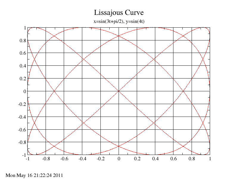
LISSAJOUS records 1000 points on a Lissajous curve defined by x=sin(3*t+pi/2), y=sin(4t).
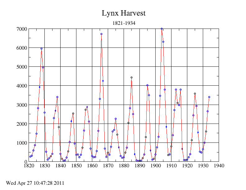
LYNX records the yearly lynx harvest from 1821 to 1934. The graph should plot the data points as circles, and connect consecutive data points with straight line segments to suggest a curve.
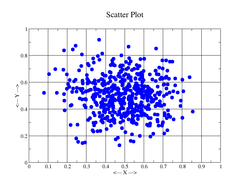
SCATTER_PLOT generates 500 pairs of (X,Y) data, which lie in the unit square, and tend to cluster around (0.5,0.5).
You can go up one level to the EXAMPLES directory.