GRAPHICS_EXAMPLES_PLOTLY1, examples of plotting data with PLOTLY version 1.
PLOTLY is an interactive browser-based plotting system that is accessible at https://plot.ly/plot
This web page discusses PLOTLY version 1. Version 2 of PLOTLY has been released, and there are substantial differences in the look of the interface.
The computer code and data files made available on this web page are distributed under the GNU LGPL license.
CSV, a data directory which contains examples of comma separated value (CSV) files;
GRAPHICS_EXAMPLES_CONVERT, examples which illustrate how various kinds of data can be processed and modified using the ImageMagick program convert() and its related tools.
GRAPHICS_EXAMPLES_DISLIN, examples which illustrate how various kinds of data can be displayed and analyzed graphically using the graphics library dislin();
GRAPHICS_EXAMPLES_GNUPLOT, examples which illustrate how various kinds of data can be displayed and analyzed graphically using the interactive executable graphics program gnuplot().
GRAPHICS_EXAMPLES_GRACE, examples which illustrate how various kinds of data can be displayed and analyzed graphically using the interactive executable graphics program grace().
GRAPHICS_EXAMPLES_OCTAVE, examples which illustrate how various kinds of data can be displayed and analyzed graphically, using the interactive executable graphics program octave().
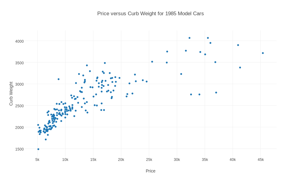
AUTOMOBILE contains 205 records, with 26 attributes, describing properties of cars available in 1985, taken from the UCI Machine Learning Repository. Some data values are missing, and are indicated by '?'. The data is comma separated, and includes text, integers, and real values. Our interest is to make a scatter plot of certain pairs of real attributes. Begin plotly() by using the "import" command to upload "automobile.txt". Specify the plot type as "scatter plot". Now examine the data and make sure that column 26 is marked "choose as x" and column 14 is "choose as y". Click on "Scatter Plot" to see the plot. Add a title and labels. Rescale the plot to 11x8.5 size by going to "Layout" and changing the width to 987. Then save as a PNG file.
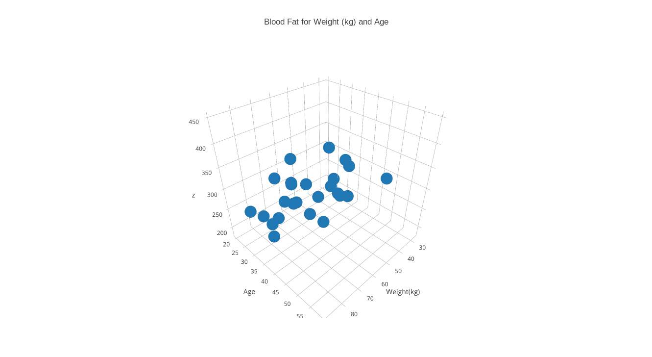
BLOOD contains 25 records, recording an index number, a group id (always 1), and the weight in kilograms, age in years, and blood fat reading for a patient. Begin plotly() by using the "import" command to upload "blood.txt". Specify the plot type as "3D scatter plot". Apply "choose as x" to column 3, "choose as y" to column 4, and "choose as z" to column 5. Click on "3D Scatter Plot" to see the plot. Add a title and axis labels. To modify the x axis label, you may have to go to the "Axis" meanu item, select "x axis" and then "label", and then replace the default "x" label by "Weight(kg)", and similarly for the y axis. Then save as a PNG file.
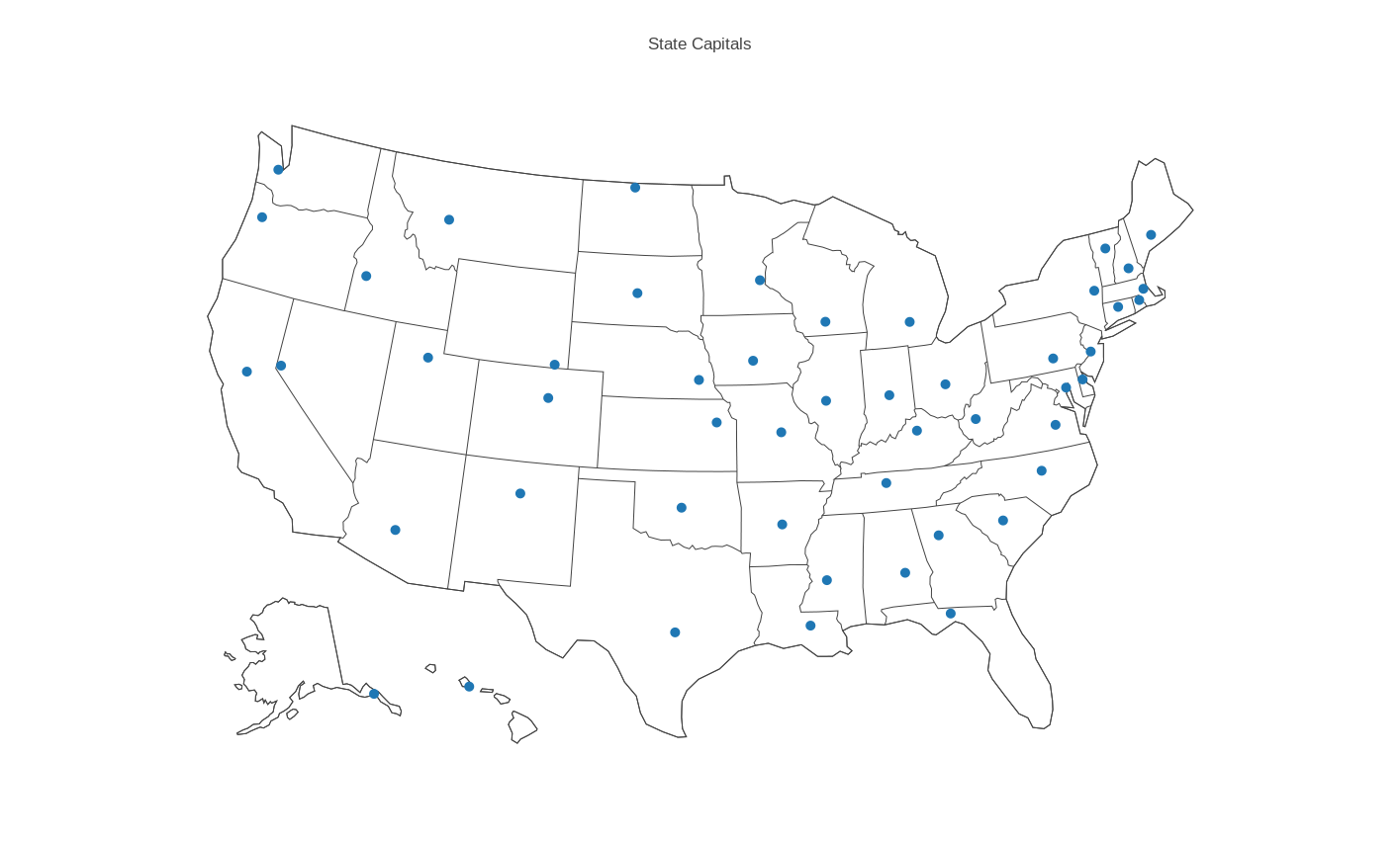
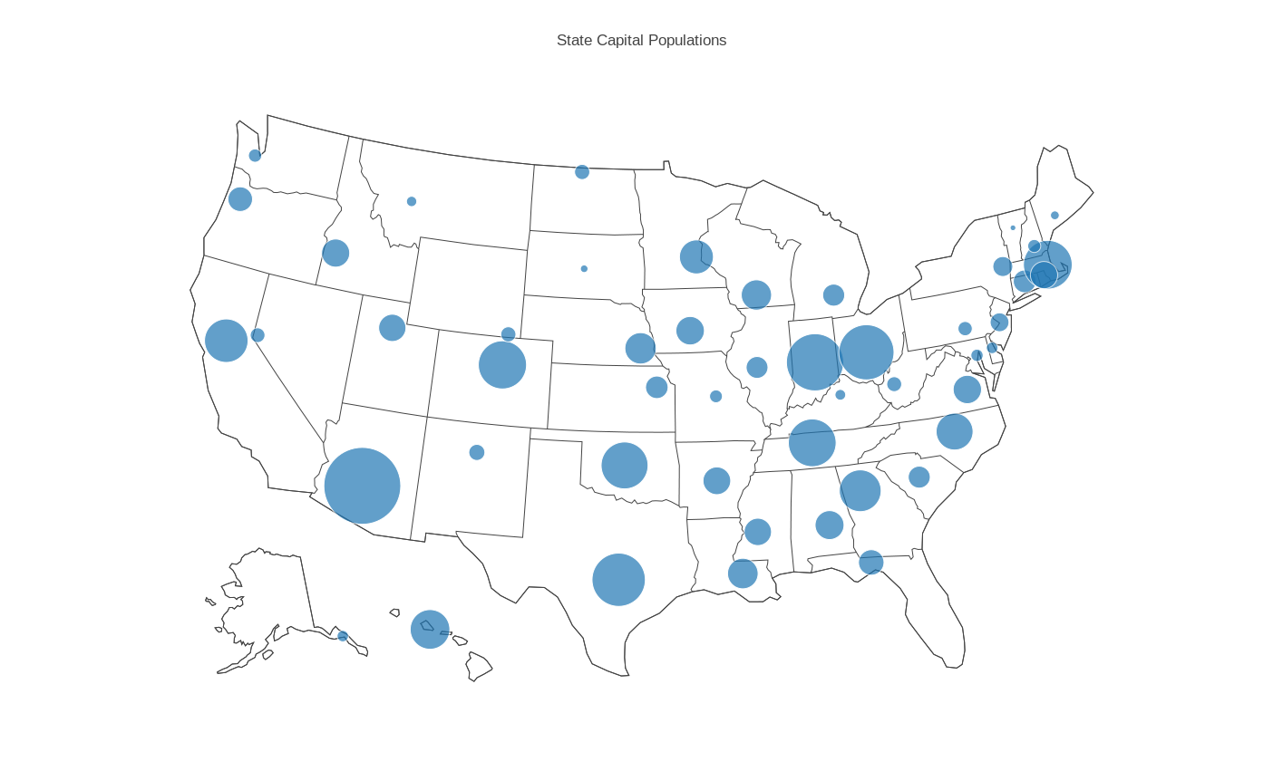
CAPITALS contains the name, state name, state abbreviation, latitude, longitude and population for each of the US state capitals.
Begin plotly() by using the "import" command to upload "capitals.csv". Specify the plot type as "scatter map". Apply "choose as lat" to column 4, "choose as lon" to column 5. Go to "Layout" and select "Geo Layout" and then for Scope choose "USA". Click on "Scatter Map" to see the plot. Add a title and save as the PNG file "capitals_scatter.png".
Begin plotly() by using the "import" command to upload "capitals.csv". Specify the plot type as "bubble map". Choose "Size by" and "Text" so we can give sizes and labels to the bubbles. Apply "choose as lat" to column 4, "choose as lon" to column 5, "choose as s" to column 6 and "choose as t" to column 1. Go to "Layout" and select "Geo Layout" and then for Scope choose "USA". Click on "Bubble Map" to see the plot. Add a title and save as the PNG file "capitals_bubble.png".
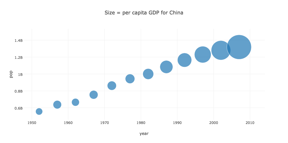
CHINA is a dataset with statistics about China. We wish to make a "bubble plot" which displays the year on the X axis, the population on the Y axis, and uses the size of the bubble as the percapita GDP. Start plotly(), and upload the file "china.csv". Select plot type "Bubble chart". Set the "choose as x" to the "year" column, and the "choose as y" to the "pop" column. Then click on "set size by" and set "choose as S" to be the gdpPercap column. Now click on "Bubble Chart" to see the plot. Add a title, and save as a png file.
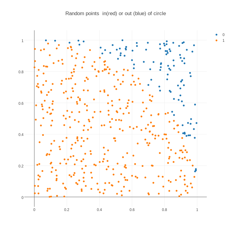
CIRCLE_INOUT depicts 500 pairs of (X,Y) data points in the unit square, 395 of which lie inside the unit circle, and 105 outside. If possible, the "inside" points should be blue, the "outside" points red, and the circle itself should also be drawn. The original data file only stored the coordinates of the points. The easiest way to convince plotly() to color some points blue and some red was to add a third column with a "1" for blue points and "0" for red. Start with "new grid". Then "import" the file 'circle_inout.txt". Then choose the "scatter plot" plot type. Then choose "group by" on the left, and select column 3 for "choose as G", that is, the value to identify groups. Now click on "Scatter plot" to display the plot. It should be a square but it's not. Go to "Axes" and set the width equal to the height. Add a title. Then save the plot as a png.
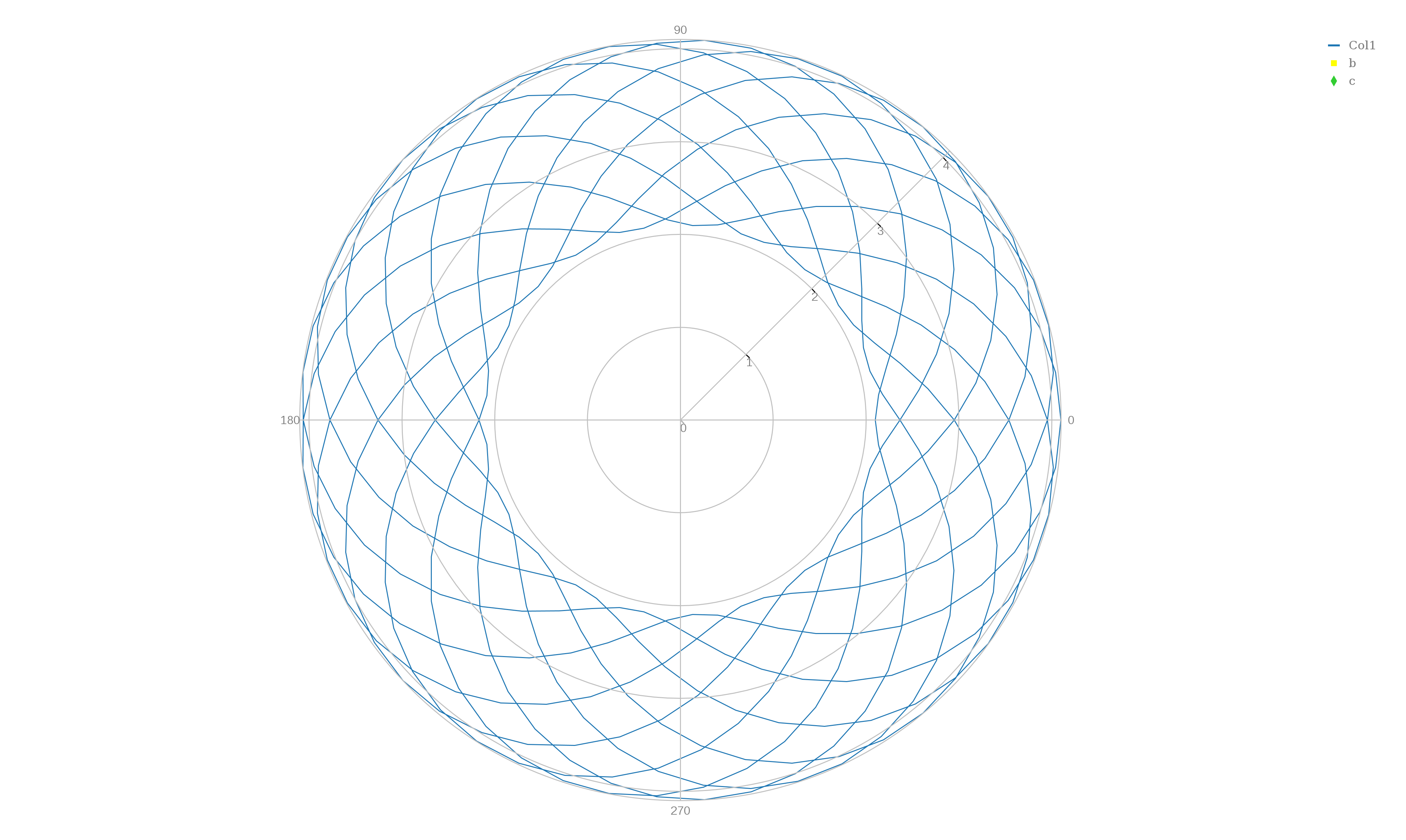
EPICYCLOID lists the polar coordinates (r,theta) of points on an epicycloid, a curve traced by a point on a small circle that rotates around a big circle. The big circle is 2.1 times the radius of the small one. A correct plot will show cusps where the curve comes closest to the center. To make a line plot, begin plotly() and "upload" the file "epicycloid.txt", choose plot type "polar line plot", "choose as y" column 1, and "choose as x" column 2 and click on "Polar Line Plot" to see the plot. Go to the "Axes" item to change the angle orientation to "CounterClockwise" and, if you like, try to change the "Radial Axis Orientation" to 0 degrees. To export the data, you can't use the little camera icon, because it isn't there, so go to the obscure upper left icon for "Export" and save as "epicycloid.txt".
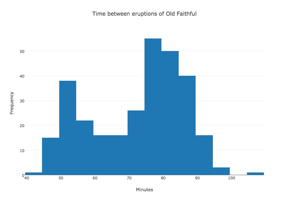
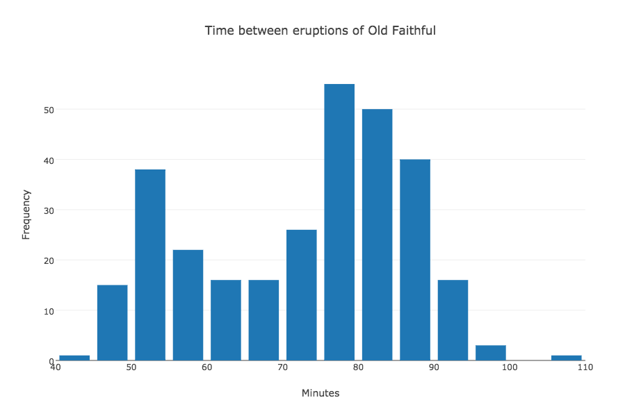
GEYSER contains the waiting time in minutes between successive eruptions of the Old Faithful geyser. 299 values are recorded. The data ranges from 43 to 108. The data comes from Martinez and Martinez. Begin plotly() by uploading "geyser.txt". Then "choose plot type" to by "histogram". You should see data consisting of two columns: the first is simply 0 through 298, which are indices added by plotly. Column 2 contains the actual data, so "choose as x" column 2. Then click on "Histogram" to see the plot. Add a title and X and Y labels and then "export" the plot as "geyser.png".
GEYSER_BINNED contains the waiting time in minutes between successive eruptions of the Old Faithful geyser, after the original 299 data items have been binned by the user. The data ranges from 43 to 108. It should be displayed in 14 bins of width 5 from 40 to 110. The data comes from Martinez and Martinez. This data is different from the geyser data because it has already been binned, that is, the user has set up a certain number of bins or ranges, and counted the number of values that belonged in each bin. This data must be displayed using a bar plot instead of a histogram. Begin plotly() by uploading "geyser_binned.txt". Then "choose plot type" to by "bar plot". You should see data consisting of two columns: "choose as x" the first column (time) and "choose as y" the second column (frequency). Then click on "Bar plot" to see the plot. Add a title and X and Y labels and then "export" the plot as "geyser_binned.png".
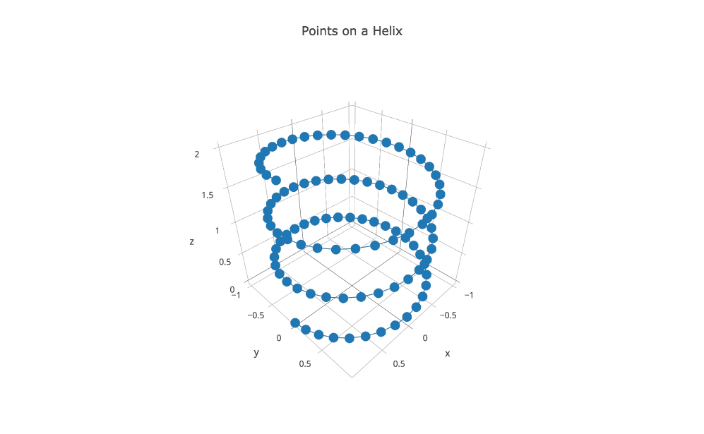
HELIX records the locations of 101 successive (x,y,z) points on a helix in 3D. We want to draw this 3D curve. Start plotly() using the "import" command to upload "helix.txt". Then "choose plot type" to be "3D line plots". Now "choose as x" column 1, "choose as y" column 2, and "choose as z" column 3. Click on "3D Line Plot" to see the plot, add a title and save as a PNG.
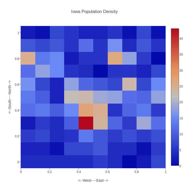
IOWA records the locations of 1000 random people living in Iowa. The x and y coordinates are normalized to vary from 0 to 1. We want to make a 2D histogram of this data, that is, a sort of checkerboard, in which the color of the squares varies from red to blue as the local population density varies from high to low. Start plotly() using the "import" command to upload "iowa.txt". Then "choose plot type" to be "2D Histogram". Now "choose as x" column 1, and "choose as y" column 3. Now click on "2D Histogram" to see the plot, add a title and labels, reset the width to equal the height, and save as a PNG.
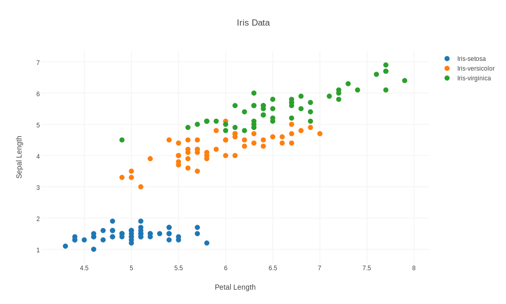
IRIS records measurements for 150 examples of 3 varieties of iris. Start plotly() using the "import" command to upload "iris.txt". Then "choose plot type" to be "scatter plot". Now "choose as x" column 1, and "choose as y" column 3. Select the "group by" option, so that a "choose as g" option appears above the columns, and apply this to column 5. Now click on "Scatter Plot" to see the plot, add a title and labels, reset the width to 987, and save as a PNG.
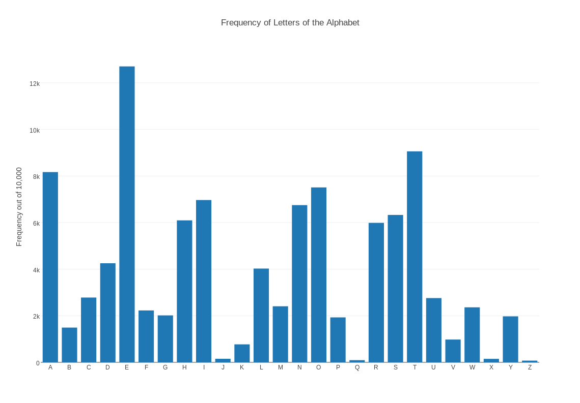
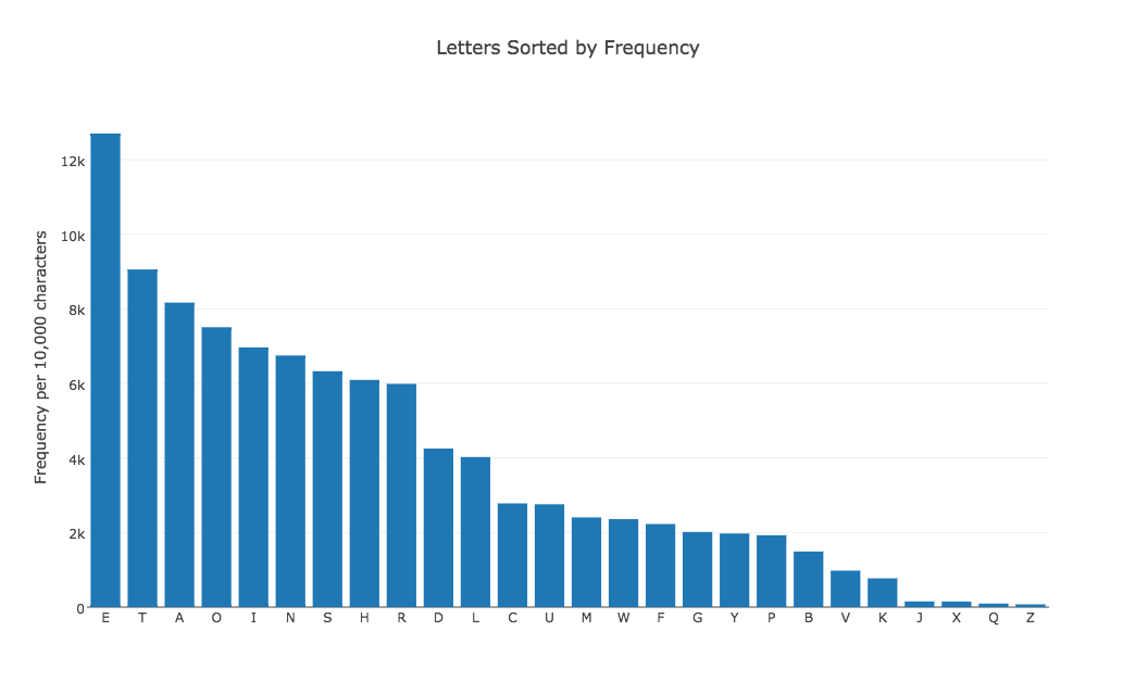
LETTERS contains the number of times each letter of the alphabet is expected to occur in a text of 10,000 characters. The file contains 26 records, with each record listing the index of the letter, the letter name (A), and a numeric frequency. The data should be displayed as a bar chart, and the letter names should appear below each bar. Start plotly() and use the "import" command on "letters.txt". Choose "bar chart" as the graph type. Use column 3 for X, and column 2 for Y. Then click on "Bar Chart" to see the plot. It's too wide, so change the width to 987. A plot of 987 x 763 is roughly 11 by 8.5. Add a title and labels, and save as a png.
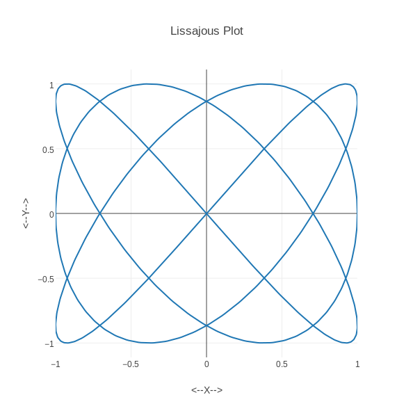
LISSAJOUS records 1000 points on a Lissajous curve defined by x=sin(3*t+pi/2), y=sin(4t). With plotly(), we first use the "import" option to upload "lissjous.txt". Then we "choose plot type" to be "line plot", and make sure that column 1 is marked "choose as x" and column 2 is "choose as y". Then we click on "Line plot" to see the plot. We can add a title and labels. Since the X and Y domains are equal, we can go to the "Layout" area and set the width to 594, so it is the same as the height. Then we save as a PNG file.
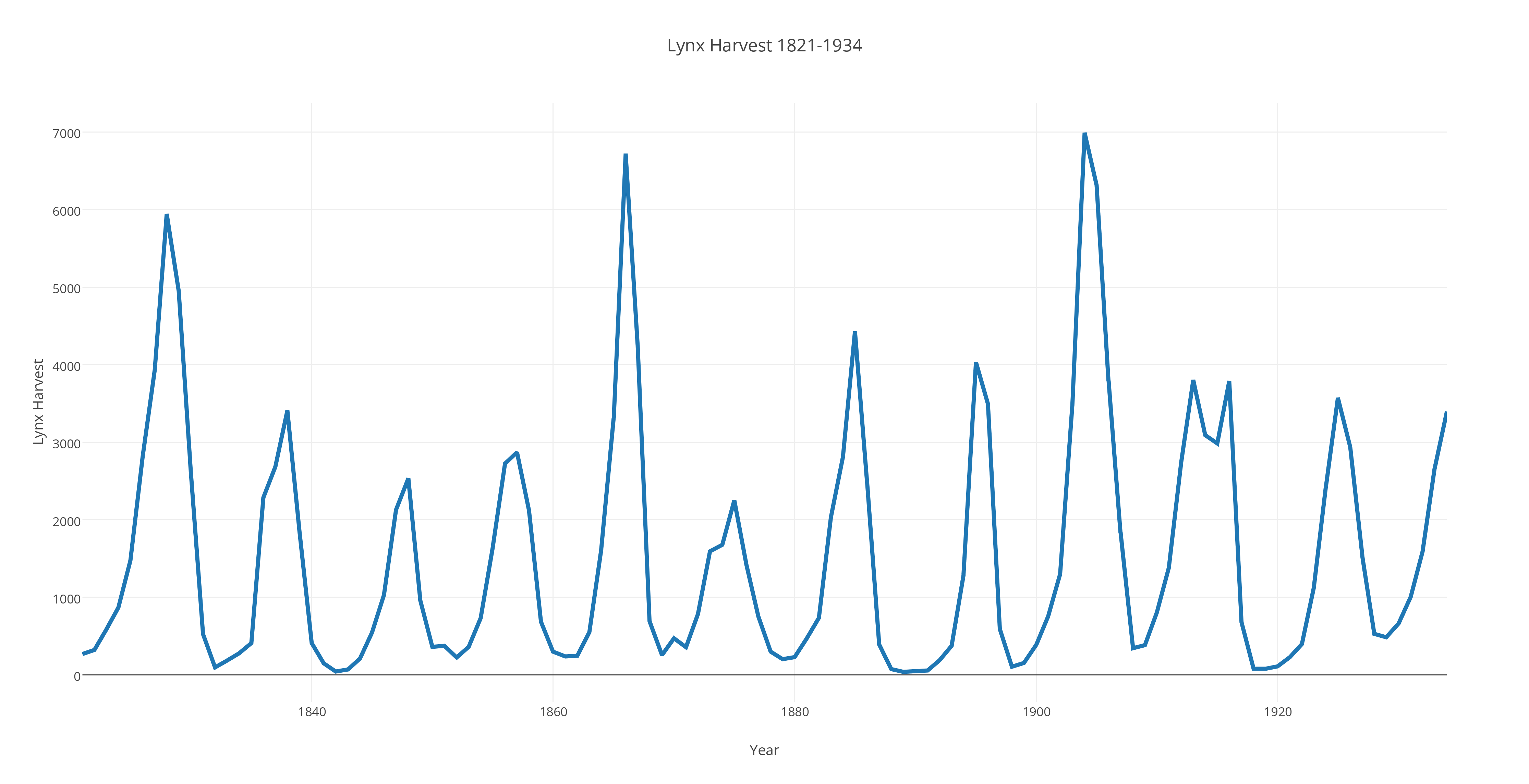
LYNX records the yearly lynx harvest from 1821 to 1934. The graph should plot the data points as circles, and connect consecutive data points with straight line segments to suggest a curve. With plotly(), we asked for a "new grid". Then we had to choose "import" with our data file "lynx.txt". Then we chose "line plot". We selected "Traces" and then "Style" and then "Lines/markers" so we could make the line have thickness "4". We added a plot title, and X and Y labels. Then we used the "export" menu item to download a version of the plot as "lynx.png".
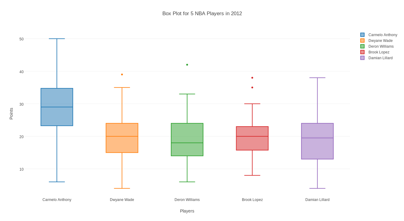
NBA records the points scored by each of 5 NBA players in 2012. The number of values scored for each player varies, depending on how many games were played. A box plot displays the minimum, 1st quartile, median, 3rd quartile, and maximum for a set of data. We can make a box plot for each of the players, on one display. With plotly(), ask for a "new grid" and "import" the data file "nba.csv". Then choose "box plot" and "select all columns". Add a plot title, and X and Y labels. Then save the plot as a png file.
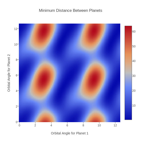
ORBITAL records, on a 101x101 grid over [0,4*pi]x[0,4*pi], the minimum distance between two planets given a pair of orbital angles. The data file contains X, Y, Z triplets, that is, angle for planet 1, angle for planet 2, minimum distance. A contour plot of this data is to be presented. With plotly(), upload "orbital.txt", then choose plot type "heat map", and select "Data Shape" to be "X,Y,Z Triplets". Then choose "Make Heatmap with Triplets" to see the plot. Add title and labels. Since both axes should have the same length, go to "Layout" and make the width 598. Then save the plot. Note that, although our data was computed on a regular grid, we could have entered scattered data as (x,y,z) triples and plotly() would still be able to make a plot.
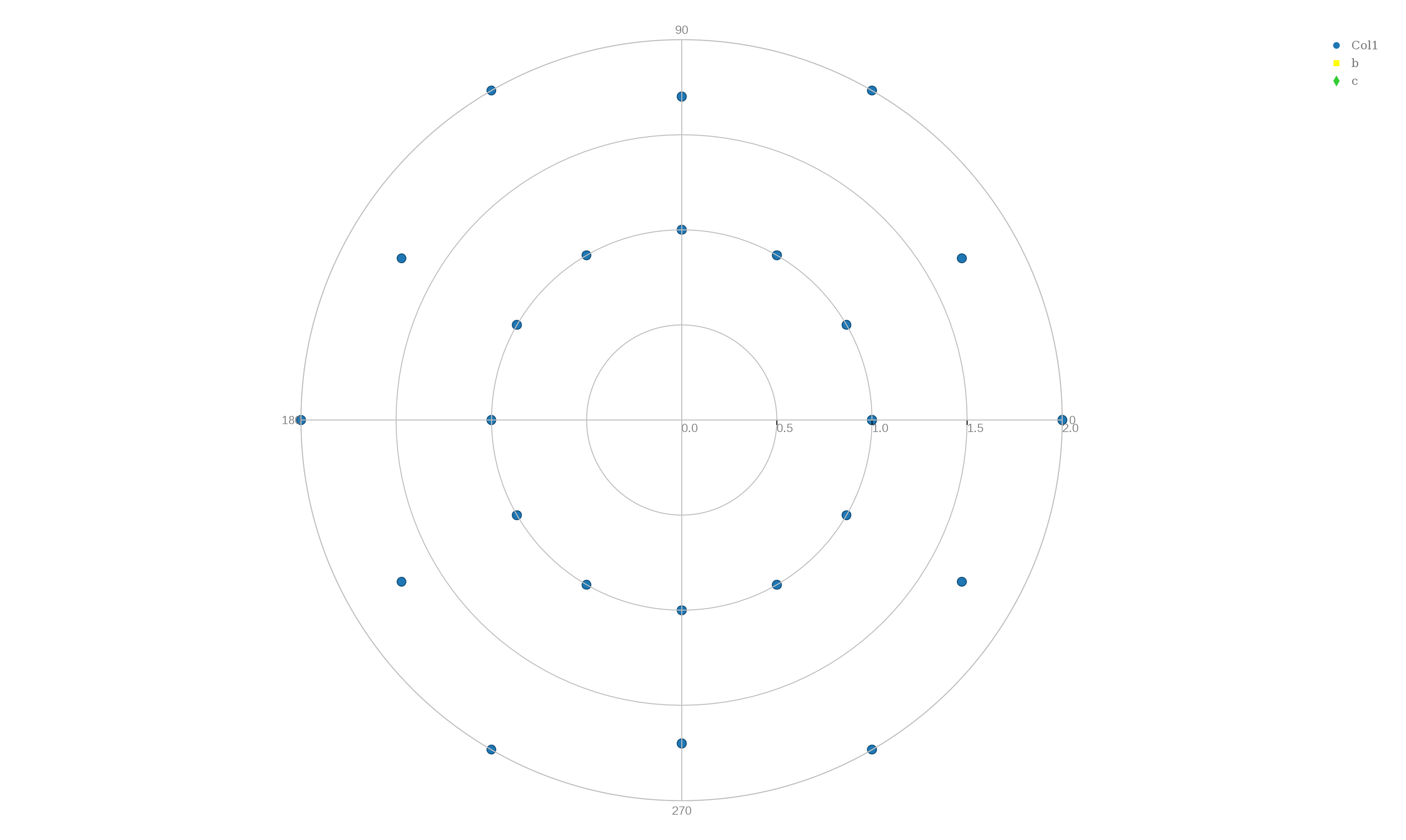
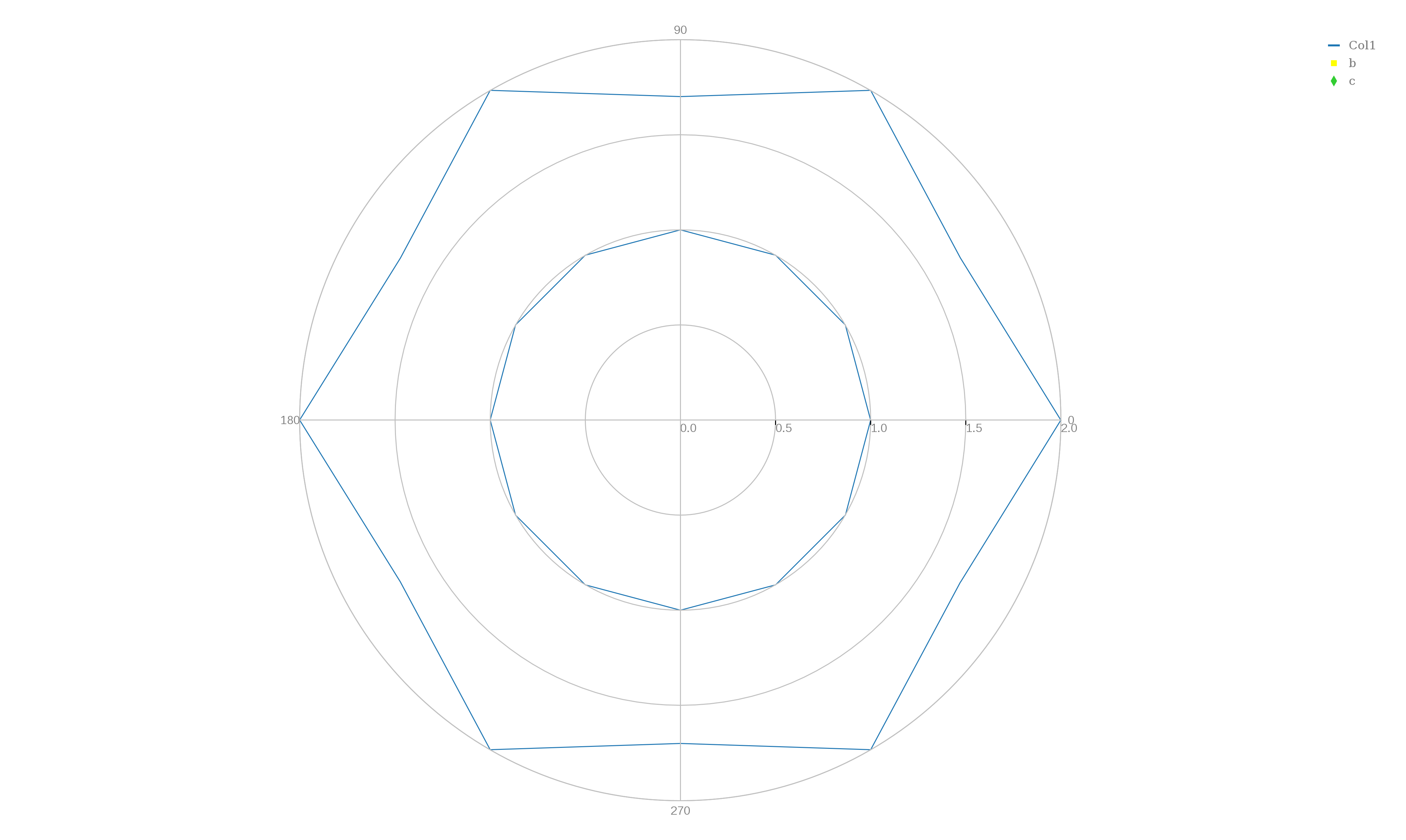
POLAR lists the polar coordinates (r,theta) of a few points. The first 13 points lie on the unit circle, and the next 13 jump between 2 and 1.7 units in distance. A line plot of this data will look like a circle inside a hexagon. Note that the plotly() polar dot and polar line commands do not seem to be well thought out, or well supported. For example, by default angles go clockwise, and the line marking radial distances is shown at -45 degrees, and you can't enter any titles, and most of the menu items do not show up. Moreover, the column choices are "choose as x" and "choose as y" instead of "choose as r" and "choose as t". Also, angles are measured only in degrees, and there is no option to use radians. Also, when plotly() draws a curve through data points, it apparently does some sort of smoothing which makes the curve look more pleasing, but can falsify the data. This is particularly evident in the epicycloid plot, where sharp cusps become smooth (and false) bumps.
To make a scatter plot, begin plotly() and "upload" the file "polar.txt", choose plot type "polar dot plot", "choose as y" column 1, and "choose as x" column 2 and click on "Polar Dot Plot" to see the plot. Go to the "Axes" item to change the angle orientation to "CounterClockwise" and, if you like, try to change the "Radial Axis Orientation" to 0 degrees. To export the data, you can't use the little camera icon, because it isn't there, so go to the obscure upper left icon for "Export" and save as "polar_points.txt".
To make a line plot, begin plotly() and "upload" the file "polar.txt", choose plot type "polar line plot", "choose as y" column 1, and "choose as x" column 2 and click on "Polar Line Plot" to see the plot. Go to the "Axes" item to change the angle orientation to "CounterClockwise" and, if you like, try to change the "Radial Axis Orientation" to 0 degrees. To export the data, you can't use the little camera icon, because it isn't there, so go to the obscure upper left icon for "Export" and save as "polar_lines.txt".
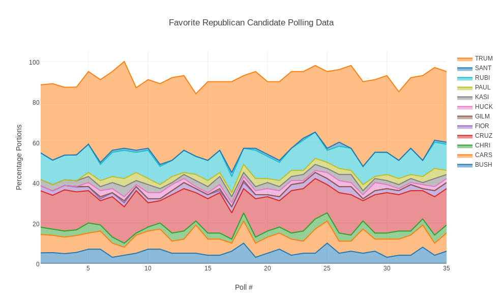
REPUBLICANS lists 35 successive polling percentages for Jeb Bush, Ben Carson, Chris Christie, Ted Cruz, Carly Fiorino, Jim Gilmore, Mike Huckabee, John Kasich, Rand Paul, Marco Rubio, Rick Santorum and Donald Trump. The plotly() area plot requires an "x" coordinate, so we simply inserted a first column that counted from 1 to 35. Secondly, the pltly area plot does not stack the percentages on top of each other, so the original data does not plot well. The first data file had to be processed so that column 2 was added to column 3, then column 3 was added to column 4, and so on. Now we "upload" the file "republicans_stacked.txt", choose plot type "area plot", "choose as x" column 1, and "choose as y" the remaining 12 columns. You can then go to each column in the data display and by choosing the tiny triangle in the upper left corner, you can change the label of that column. Thus, I changed column 1 to "Poll" and column 2 to "BUSH" and column 3 to "CARS" and so on. Then press "Area Plot" to see the plot, add titles and labels. To make it easier to print, go to "Layout" and change the width to 987. Then save it.
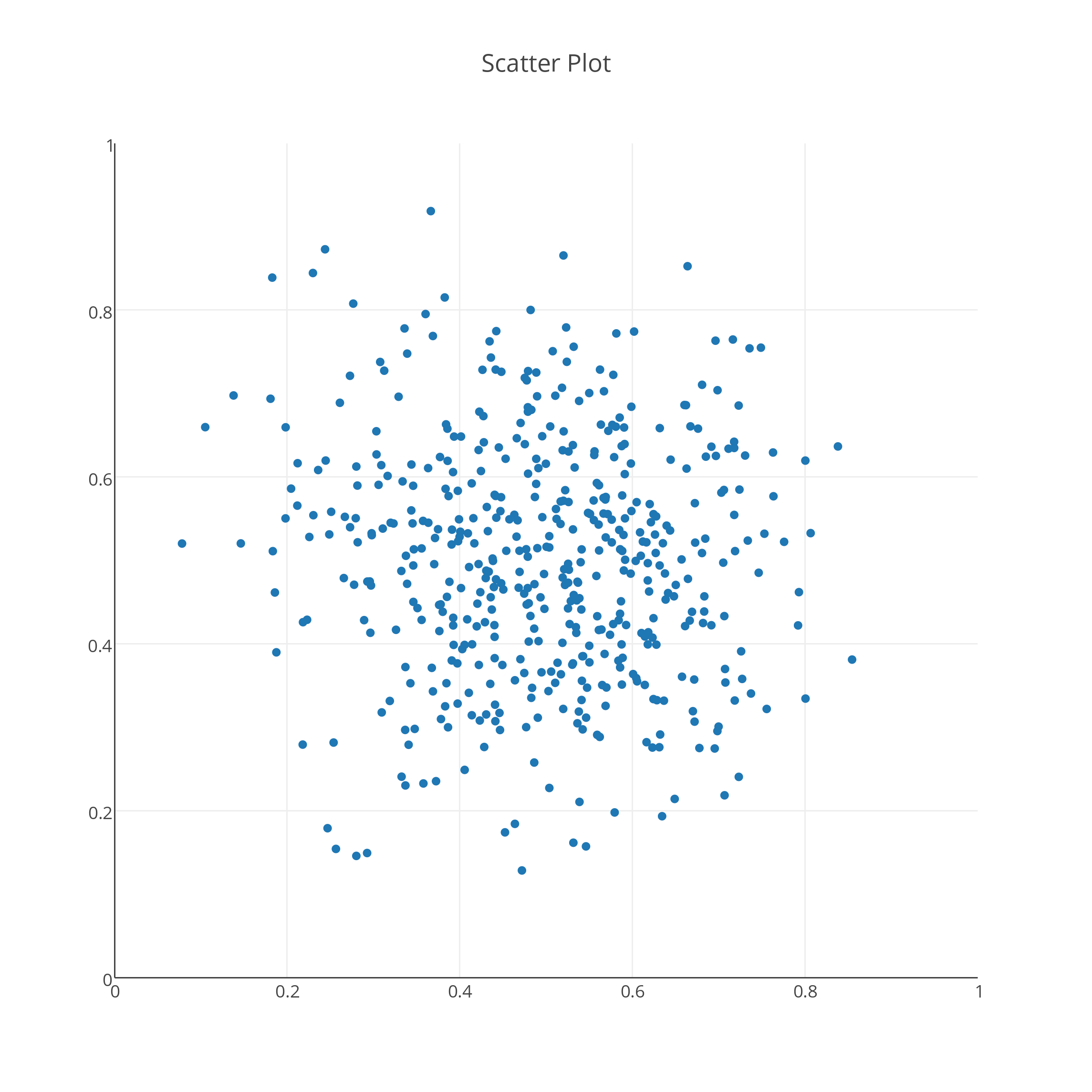
SCATTER_PLOT generates 500 pairs of (X,Y) data, which lie in the unit square, and tend to cluster around (0.5,0.5). In plotly() I began by requesting "new grid". Then "import" <= "scatter_plot.txt". Then I changed from "line plot" to "scatter plot". Then I clicked on the large "Scatter plot" and the plot appeared. To make the plot square, I went to "Layout" and set the "width" to 763, so that it matched the value of "height". Then I went to "Axes" and changed the range so that it went from 0.0 to 1.0. Then I entered a title for the plot. Finally, I used "export" to save it.
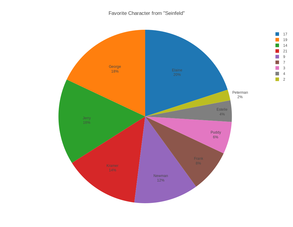
SEINFELD records, for each of 10 characters from "Seinfeld", the percentage of the population that chose that character as their favorite. In plotly(), start with a "new grid", then "upload" the file "seinfeld.txt". Go to "choose plot type" and select "pie chart". Now let column 1 be used as "T" (text), column 2 be used as "L" (size of slice) and column 3 be used as "V" (color of slice). Add a title, and save the plot as a PNG file.
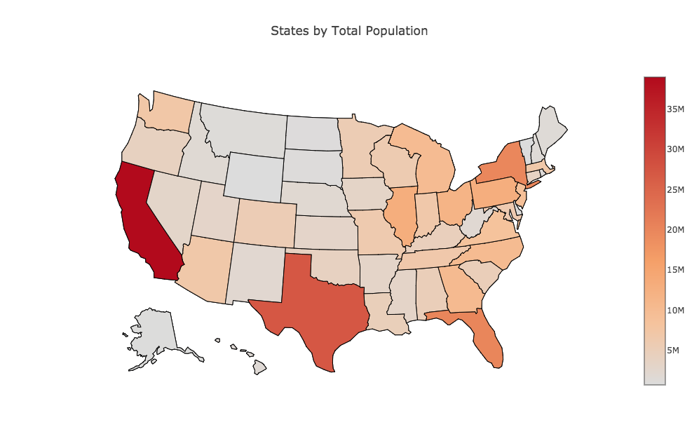
STATES records, for each of the 50 US states, an index, the full name, the two letter abbreviation, and the population. We want to make a map of the US in which the color of each state indicates its population. Start plotly(), and choose "Import" with "states.csv". Now "choose plot type" to be "chloropleth". On the left hand side, under "Location Codes", choose "USA State Abbreviations", and under "Options" choose "Text". Now "choose as l" column 3, "choose as v" column 4, and "choose as t" column 2. Then click on "Chloropleth Map" to see the plot. Add a title, and and save the plot as a PNG file.
SURFACE_TRIPLES records, on a 41x41 grid over [-2,2]x[-2,+2], the values z = exp(-(x^2+y^2)) * cos(0.25*x) * sin(y) * cos(2*(x^2+y^2)). We want to plot the data as a heat map (contour plot). Start plotly(), using the "import" command on "surface triples.txt". Choose the plot type to be "heat map". Apply "choose as x" to column 1, "choose as y" to column 2, and, after specifying the data type to be "(X,Y,Z) triples", apply "choose as z" for column 3. Now click on "Heat Map" to see the plot. Add a title and labels, then under "Layout" adjust the width to be the same as the height, and save the plot as a png. Note that we cannot use this data to create a 3D surface, because plotly() will only do that for data stored as a "Z matrix". See the "surface_matrix" example for more information.
SURFACE_MATRIX records, on a 21x21 grid over [-2,2]x[-2,+2], the values z = exp(-(x^2+y^2)) * cos(0.25*x) * sin(y) * cos(2*(x^2+y^2)). Now we want to plot as a 3D surface plot. But plotly() will not allow us to make a 3D surface plot with (x,y,z) data. It must be a Z matrix, that is, data on an M by N grid, stored in a file with M rows, each containing N values separated by commas. This means we can't use the (x,y,z) triple format, but instead must use the matrix format. Start plotly() and use the "import" command on "surface_matrix.txt". Select plot type "3d surface plot". Then "select all columns" and apply "choose as z". Now click on "3d surface plot" to see the plot. Add titles, adjust the width, and save as png.
TOURISTS contains the number of tourists to Apple beach each month. The file contains 12 records, with each record listing the index (1-12) of the month, the number of tourists, and a 3 letter month abbreviation. The data should be displayed as a bar chart, and the month abbreviation should appear below each bar. Start plotly() and use the "import" command on "tourists.txt". Choose "bar chart" as the graph type. Use column 3 for X, and column 2 for Y. This way, the month names will appear beneath the bars. Then click on "Bar Chart" to see the plot. It's too wide, so change the width to 987. A plot of 987 x 763 is roughly 11 by 8.5. Add a title and labels, and save as a png.
TRAJECTORY follows the estimated position of a ball dropped from a 10 story building. The height of the ball is recorded each second. We want to plot the data, but more importantly, we want to find a simple formula that approximates the data. This is called finding a fit to the data. Start plotly() and use the "import" command on "trajectory.txt". Choose "Scatter plot" as the graph type, and "choose as x" for column 1, and "choose as y" for column 2. Click on "Scatter Plot" to see the plot of the data. Now select "Fit data" from the left menu, and for the fit type select "linear", then choose "Run this fit". This will cause a straight line to appear on the plot, along with the formula that generated it. Choose "Add result as plot annotation" to keep this information as part of the plot. You may want to drag this annotation a short distance below the line, to keep it out of the way. Not select "Fit data" again, but this time choose "Quadratic" as the fit type, and then "Run this Fit". A new curve will appear, which is a better fit to the data, along with its formula. Again, choose "Add result as plot annotation", and this time, drag the annotation a short distance above the data, so that both formulas are visible. Finally, add a title and labels, and save as a png.
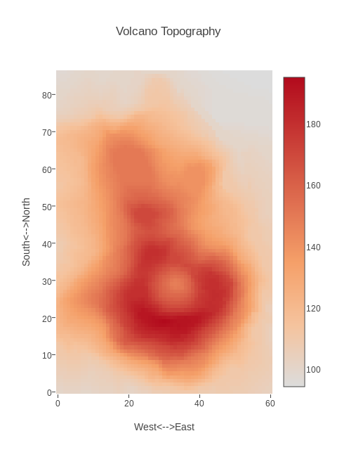
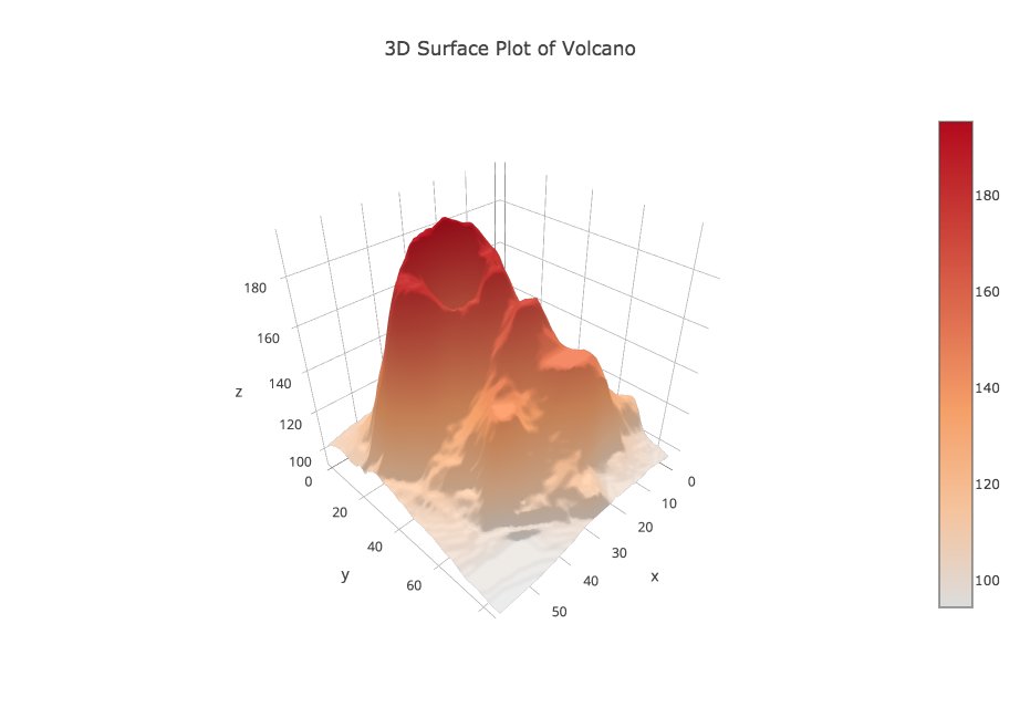
VOLCANO records the topography of a volcano as a list of measurements of elevation Z at regular (X,Y) grid points. The data is stored as a "Z" matrix, that is, one row of the file contains all the Z values at a particular Y value.
To have plotly() plot this data as a heat map (contour plot), upload the file "volcano.csv". Then choose plot type "heat map". Now under data shape choose "Z matrix", which indicates that the data file contains an MxN set of Z values with N values on each line of the file. In order to get a plot, you want every column of data to be marked "choose as Z". Look for the "select all columns" option! Now choose "Make Heatmap" to see the plot. You can add a title and labels. Since there are 61 horizonal measurements and 87 vertical measurements, if we want the plot to match up with the volcano's shape, we need to choose a width and height that are roughly in a 6 to 8 ratio. I choose a width of 480=6*80 and a height of 640=8*80. Finally, save the plot in the PNG format.
To have plotly() plot this data as a 3D surface map, upload "volcano.csv". Then choose plot type "3D Surface". Now under data shape choose "Z matrix", which indicates that the data file contains an MxN set of Z values with N values on each line of the file. In order to get a plot, you want every column of data to be marked "choose as Z". Use the "select all columns" option. Now choose "3D Surface" to see the plot. You can add a title and labels, and adjust the width, and try to save it as a PNG file. However, the save operation failed on a Linux machine with Firefox, and on a Mac with Safari. It did work finally on a Mac with the Chrome browser.
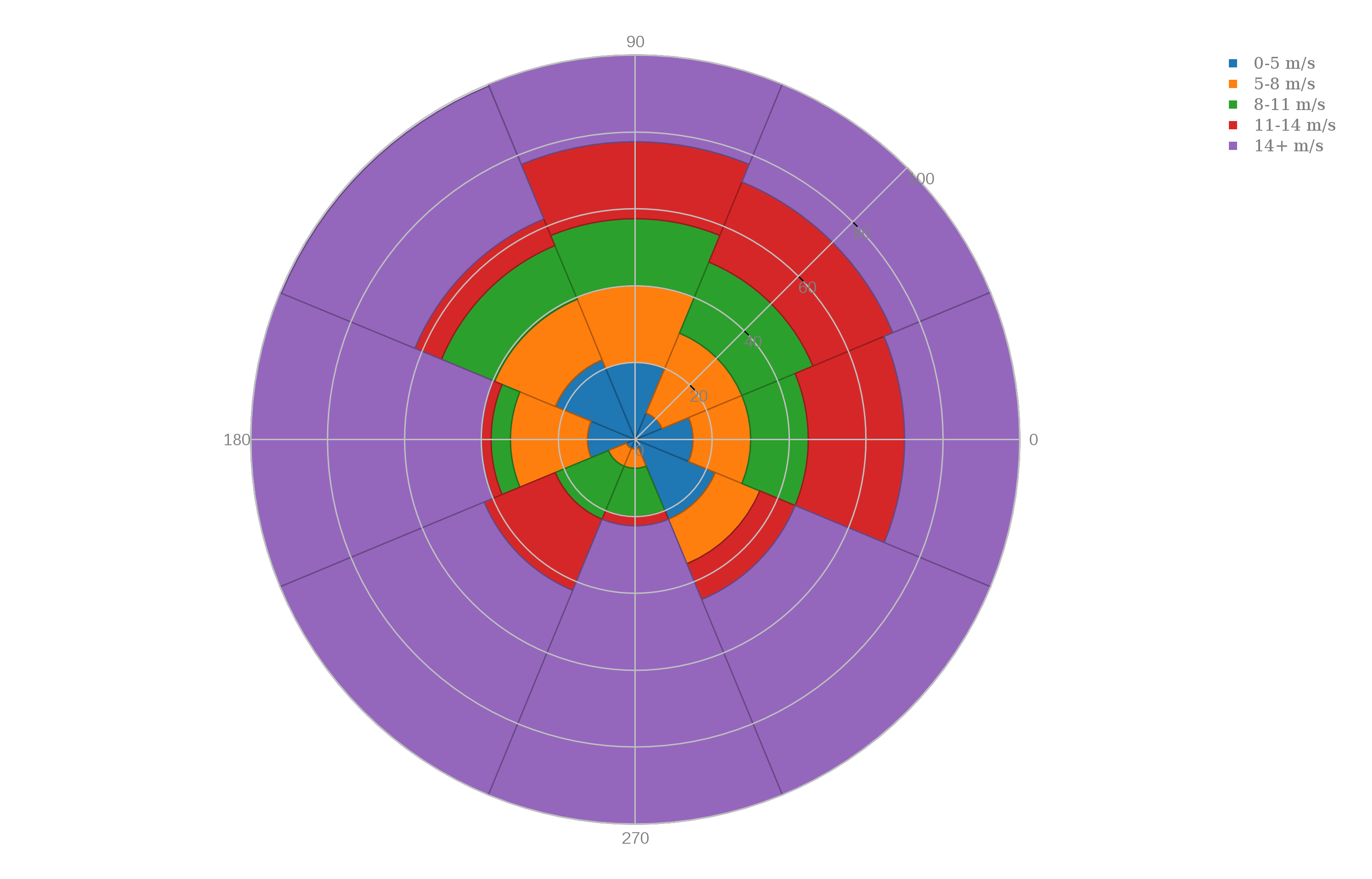
WIND records, for each of 8 directions, the percentage of time the wind speed fell in the range 0-5 m/s, 5-8 m/s, 8-11 m/s, 11-14 m/s, and 14+ m/s. We want to make a polar area chart, which is a sort of stacked histogram where the values are associated with a direction.
We want to make a "polar area" chart, which is something like a cross between a pie chart and a bar chart. Start plotly() and use the "import" command on "wind.csv". Choose the plot type to be "Polar area chart". Then "choose as x" for column 1, (the direction, measured in degrees) and "choose as y" columns 3, 4, 5, 6, and 7. Click on "Polar Area Chart" to see the plot. Now go to "axes" and select "style" and change the angular orientation to "CounterClockwise". Then go to the "Export" icon and save the plot as a PNG file.
We want to make a "polar bar" chart, which is something like a bar chart for which the data is associated with angles, so we draw a bar at the corresponding angle. Some polar bar charts look like the spokes of a wheel. Start plotly() and use the "import" command on "wind.csv". Choose the plot type to be "Polar bar chart". Then "choose as x" for column 1, (the direction, measured in degrees) and "choose as y" columns 3, 4, 5, 6, and 7. Click on "Polar Bar Chart" to see the plot. Now go to "axes" and select "style" and change the angular orientation to "CounterClockwise". Then go to the "Export" icon and save the plot as a PNG file.
You can go up one level to the EXAMPLES directory.