GRAPHICS_EXAMPLES_GNUPLOT, Gnuplot scripts which illustrate how various kinds of data can be displayed and analyzed graphically using the interactive executable graphics program GNUPLOT.
The computer code and data files made available on this web page are distributed under the GNU LGPL license.
GRAPHICS_EXAMPLES programs are available in a C version and a C++ version and a dataset version and a FORTRAN77 version and a FORTRAN90 version and a MATHEMATICA version and a MATLAB version.
GNUPLOT, examples which illustrate the use of the GNUPLOT graphics program.
GRAPHICS_EXAMPLES_CONVERT, examples which illustrate how various kinds of data can be processed and modified using the ImageMagick program convert() and its related tools.
GRAPHICS_EXAMPLES_DISLIN, examples which illustrate how various kinds of data can be displayed and analyzed graphically using the graphics library dislin();
GRAPHICS_EXAMPLES_GRACE, examples which illustrate how various kinds of data can be displayed and analyzed graphically using the interactive executable graphics program grace().
GRAPHICS_EXAMPLES_OCTAVE, examples which illustrate how various kinds of data can be displayed and analyzed graphically, using the interactive executable graphics program octave().
GRAPHICS_EXAMPLES_PLOTLY1, examples which illustrate how various kinds of data can be displayed and analyzed graphically, using the plotly() program (version 1) from a browser.
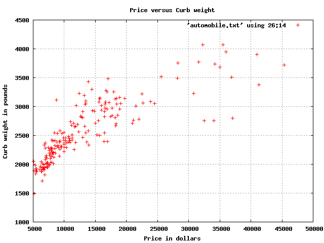
AUTOMOBILE contains 205 records, with 26 attributes, describing properties of cars available in 1985, taken from the UCI Machine Learning Repository. Some data values are missing, and are indicated by '?'. The data is comma separated, and includes text, integers, and real values. Our interest is to make a scatter plot of certain pairs of real attributes.
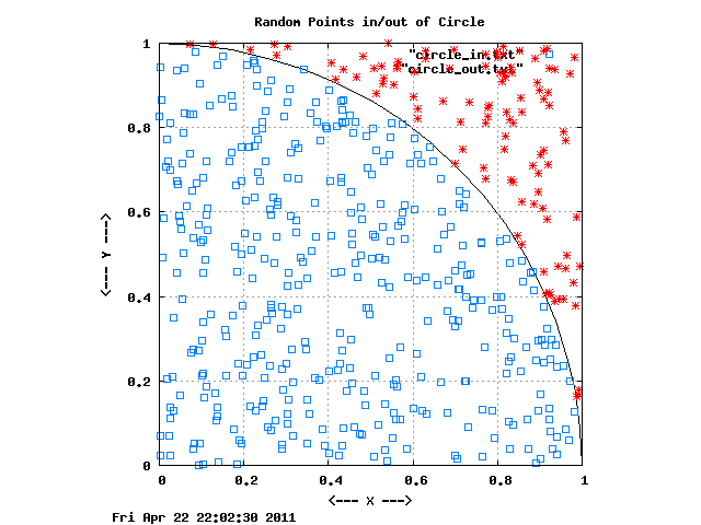
CIRCLE_INOUT depicts 500 pairs of (X,Y) data points in the unit square, 395 of which lie inside the unit circle, and 105 outside. If possible, the "inside" points should be blue, the "outside" points red, and the circle itself should also be drawn.
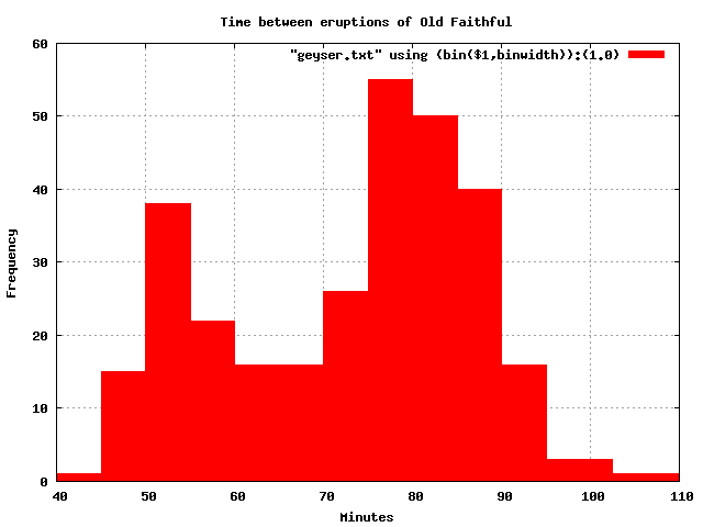
GEYSER contains the waiting time in minutes between successive eruptions of the Old Faithful geyser. 299 values are recorded. The data ranges from 43 to 108. The data is AUTOMATICALLY binned by gnuplot (although the commands to do this are, naturally, somewhat obscure). The data comes from Martinez and Martinez.
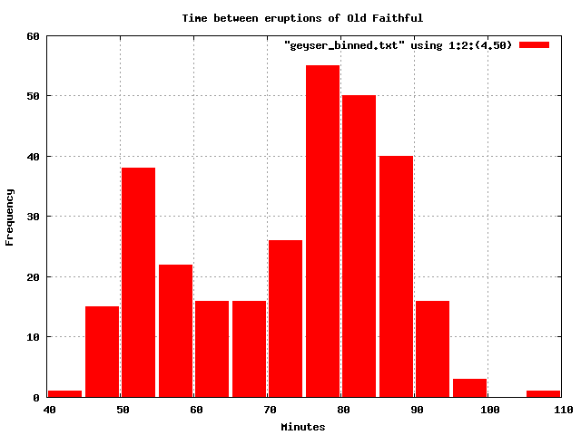
GEYSER_BINNED contains the waiting time in minutes between successive eruptions of the Old Faithful geyser, after the original 299 data items have been binned by the user. The data ranges from 43 to 108. It should be displayed in 14 bins of width 5 from 40 to 110. The data comes from Martinez and Martinez.
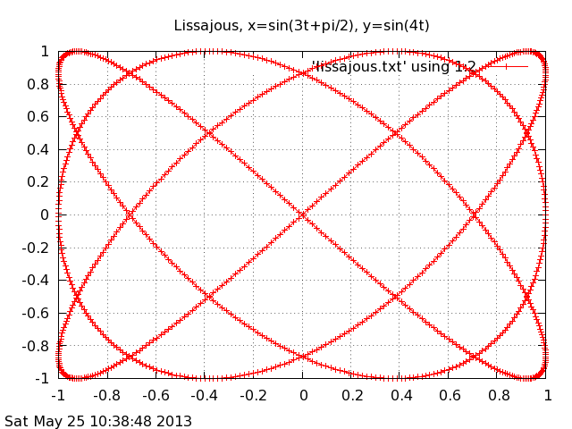
LISSAJOUS records 1000 points on a Lissajous curve defined by x=sin(3*t+pi/2), y=sin(4t).
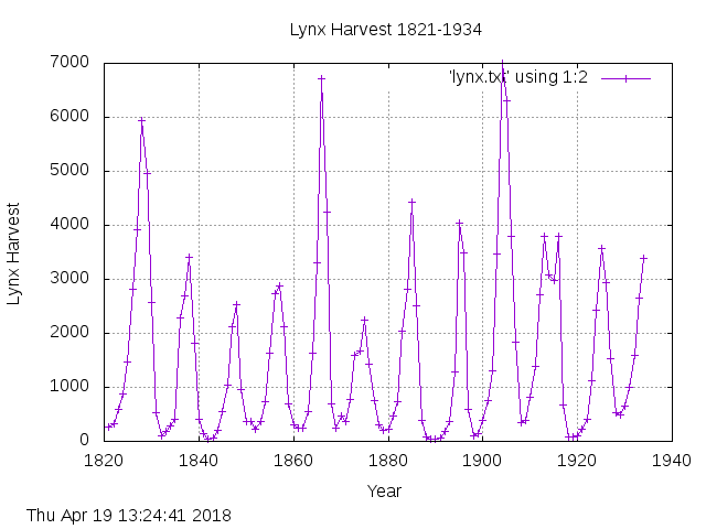
LYNX records the yearly lynx harvest from 1821 to 1934. The graph should plot the data points as circles, and connect consecutive data points with straight line segments to suggest a curve.
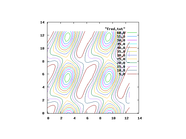
ORBITAL records, on a 101x101 grid over [0,4*pi]x[0,4*pi], the minimum distance between two planets given a pair of orbital angles. A contour plot of this data is to be presented. GNUPLOT's SPLOT command will not accept the original data file. Instead, we had to use the SORT command so that the (X,Y) data was sorted, and then insert a blank line after every 101 records, so that the data was stored as blocks of data that represented lines along fixed X coordinates.
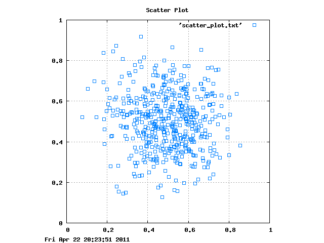
SCATTER_PLOT generates 500 pairs of (X,Y) data, which lie in the unit square, and tend to cluster around (0.5,0.5).
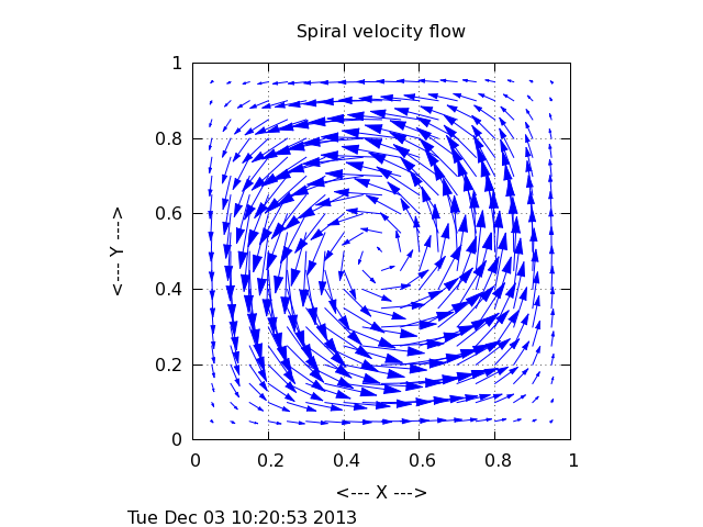
SPIRAL records on a 21 by 21 grid the location and velocity of a fluid in a 1.0x1.0 box. We wish to display a plot showing velocity vectors.
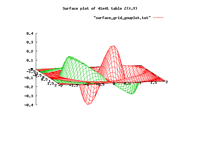
SURFACE_GRID records, on a 41x41 grid over [-2,2]x[-2,+2], the values z = exp(-(x^2+y^2)) * cos(0.25*x) * sin(y) * cos(2*(x^2+y^2)). The data is to be plotted as a surface. GNUPLOT's SPLOT command will not accept the original data file. Instead, we had to use the SORT command so that the (X,Y) data was sorted, and then insert a blank line after every 41 records, so that the data was stored as blocks of data that represented lines along fixed X coordinates.
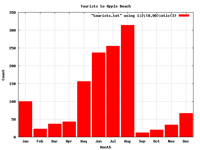
TOURISTS contains the number of tourists to Apple beach each month. The file contains 12 records, with each record listing the index (1-12) of the month, the number of tourists, and a 3 letter month abbreviation. The data should be displayed as a histogram, and the month abbreviation should appear below each bar.
You can go up one level to the EXAMPLES directory.