Plotting
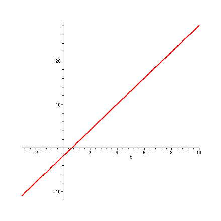
Graphs of functions are produced by the plot command. In its simplest form, plot needs to know the function to be plotted and the range of values for the independent variable. Note that a..b is Maple's way of describing the interval [a,b]. Observe that I have placed signed titles on some of these graphs. When you actually print plots to turn in with your homework, they MUST have a title and signature [by your initials or last name]. Again, try to predict the output before tapping the return key!
> plot( 3 * t - 2 , t = -3 .. 10 ) ; # WAIT FOR THE GRAPH TO APPEAR!!

> plot( f , x = -Pi .. 2 * Pi ) ;
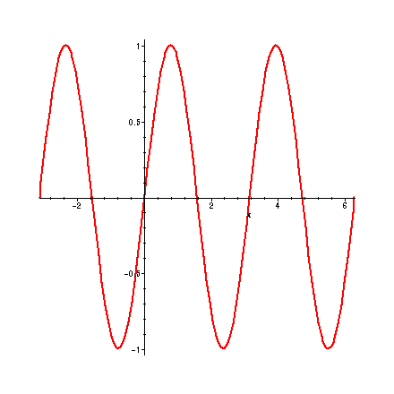
> plot( p , x = -6 .. 8 , title = ` f * g [by DM] ` );

>
These plots are nice, but what information do they convey? Let's concentrate on the plot of p, that is f*g. Position the cursor on a point on the graph and click the left button. The numbers that appear on the upper-left corner are the coordinates of the current location of the cursor. Use this technique to identify the global maximum and minimum values of f*g on the interval [-6, 8], and the x-values at which these are found. Where do other (local) minima and maxima occur? Can you guess the exact values?
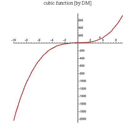
> plot(2 * u^3 + 4 * u - 5 , u = -10 .. 7 , title = ` cubic function [by DM] ` ) ;
>
Where does the cubic function cross the u-axis? Maybe it would be helpful to cut down the plotting interval from [-10, 7] to [-1, 3], or even narrower, say to [0, 1.5]. Try it. Can you find the u-intercept to 2-decimal point accuracy by this process? It is a powerful method, which we call ZOOMING IN.
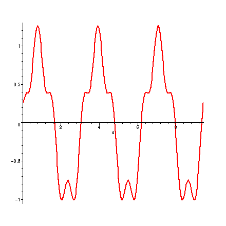
> plot( s , x = 0 .. 3 * Pi );
> plot( q , x = -1.2 .. 1.2 ) ;

>
Can you explain why the graphs of s and q look the way they do?
>
Housecleaning